Design Post #002 - Level Design Process
This post originally came from the Monochrome RPG's Patreon page
Hello, Patrons and readers! I’ve got some interesting updates on Monochrome for you. Have you ever wanted to know what environments in a game look like before all the art is done? Well, have I written the post for you! I (Andrew, DVNC Design Intern), as well as my good friend (Lilly, also a DVNC Design Intern), have been hard at work drafting blueprints for various locales throughout the world of Monochrome. I’ll show you some of my designs, talk through some of my processes, and give you a fun look behind the scenes!
A lot of my general design philosophy is inspired by a great article by Adrian Bauer in the first issue of “A Profound Waste Of Time”. Adrian worked on Savant Ascent and Owlboy. The magazine can be found here, and Adrian’s twitter can be found here.
Preliminary Design
First, I start with an initial sketch. I will sometimes do these on paper, trying to get a feel for how the space should be laid out on a broader scale. Initial concerns mainly consist of thinking about the number of paths I want the player to be presented, the order I want the player to see these paths, the player’s goal in the space, and the emotions I want to convey.
Here’s an example of a sketch I did. I did these in Adobe Illustrator instead of paper so they’re nicer to look at, but in these preliminary sketches, it’s good to get messy.
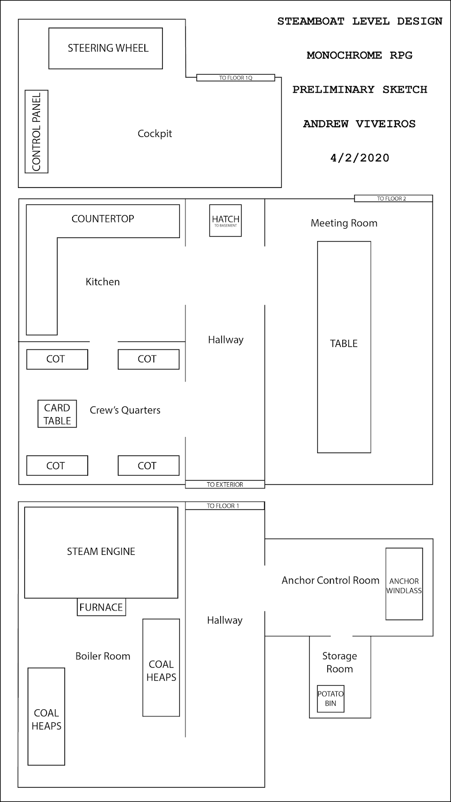
This sketch is the first floor of a Steamboat interior. The number of paths I decided to present to the player is two. One main path which takes a circuitous route, showing off all aspects of the interior. When doing level design you have to consider players who are addicted to overturning every stone, the completionists who can’t move on until they’ve spoken to every NPC and gotten every useless health potion. From the very start, the player can see into the crew’s quarters, which will entice a player like that to go that way.
From there, the completionist’s path circles clockwise, investigating the kitchen. The player then sees the hatch, one of two portals to other floors. The meeting room is immediately in frame as soon as the hatch is, so a player is likely to continue into that room before checking downstairs. This way, we are able to deliver all the information about this floor to our completionist friend without losing them to the basement or sending them backtracking unnecessarily.
The other route is more direct and would be taken by a player who is perhaps more concerned with the narrative of the game, a mainliner who may have played the game before and therefore is less interested in every nook and cranny. There is a straight path from the entrance of this floor to the first portal. If you need to get to the basement quickly, the rest of the environment doesn’t get in your way.
This was also a concern on the second floor. It’s placed in the upper right-hand corner to allow the mainliner to easily go from the basement to the second floor. To simplify all of that information, I designed two paths, one which takes the player to see everything, and one which gets them to the destinations as soon as possible.
FINALIZED DESIGN
This is a finalized design/blueprint for the first floor of the Steamboat. There are a few major additions to the pathing and signposting of the level, which I’ll go over.
Perhaps the biggest additions are the two sizable crates in the main hallway. These break up movement along the straight hallway, which means that while it does add a little bit of time to the mainliner’s path, it breaks up the kinetics of the walk. Instead of just holding a button until you’re outside, you have to be active in the game. This ought to keep players engaged, and maybe even entice them to check out the extraneous rooms.

The second major change was to the layout of the kitchen. I’ve added an additional, clockwise rotation to the path of the completionist. The two parallel tables add a little complication so that the completionist has to resolve their own path rather than simply following a line I’ve drawn for them.
I wanted to strike a balance between giving a player what they want (quick ambulation/seeing everything), and putting obstacles in their way (crates requiring strafing, tables requiring decision making). If there were no obstacles, players would become bored. There’d be no gears turning as they follow the mainline or explore the edges. If things go wrong, the mainliner will feel like the environments are a chore to get to the actual meat of the game, and the completionist will feel like they’re trudging through a checklist, just to see everything.
I can’t force players to want to play the game a certain way, but I can anticipate ways they’re going to play and design around their goals. I want them to be fulfilled by their experience with Monochrome, and that revolves around letting them play their way. I can’t be too nice, of course. Hopefully, in the final game, players will feel unimpeded, but not bored.
Monochrome is an RPG in the style of classic early 20th century animated films. You can back the Patreon here (or follow this link). You can try out the demo here. I’ve got a personal twitter where I post about development work I do, as well as plenty of bad jokes. You can follow me here.